 Tweet
Tweet
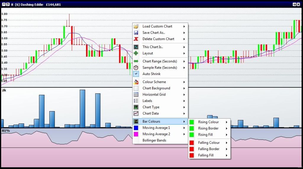
Does anyone know how to get my candlestick charts to look like this in the top right hand corner of this screen. my chart tends to have a line from the closing price of that period to the next whereas i want two separate candles.
i currently select PRICE CANDLE OHLC.
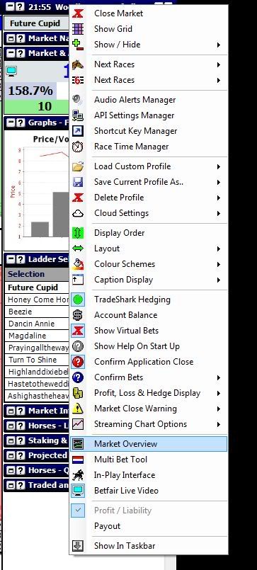
Preferred Layout
i currently select PRICE CANDLE OHLC.
Preferred Layout


Comment